Pages

Showing posts with label Illumination. Show all posts

Tuesday, June 11, 2013

Dragon's Barb Scroll

I received a scroll assignment with the following information:

Court of the Majesties Lucien and CatarinaAt Border Skirmish in Their Shire of RavenslakeJune 8th, 2013 A.S. 48Award - Award of the Dragon's BarbRecipient - Sebastian Elgar (MKA Peter Czyzweski) From the Shire of Blackhawk/Region of the MidlandsFor: Helping to bring archery to the Shire of Blackhawk and maintaining equipment and practice for Shire members.

I did some preliminary research on the internet on the recipient before designing the scroll.  I wasn't able to find many images or information of the recipient in any particular period garb.  The few images I found were general nondescript red and black colored fencing armor.  The only image I could find of the recipient doing archery was in mundane clothing.  For this reason I chose to do a scroll which wasn't based on any particular time period and "simply make it look pretty".

The following interest struck me as kind of funny.  I found it on the individual's FB page.  Kind of funny that I was standing right behind him.  That funny looking dude with the peach Elizabethan outfit is me.


I wrote up the follow scroll text to be used:
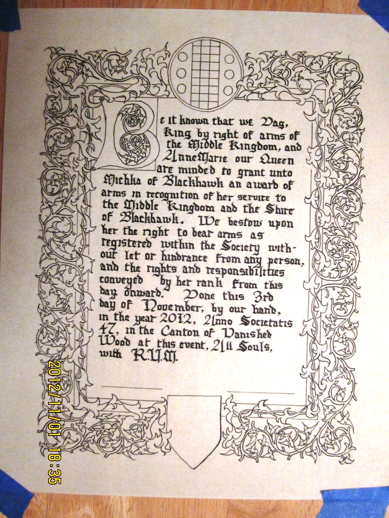
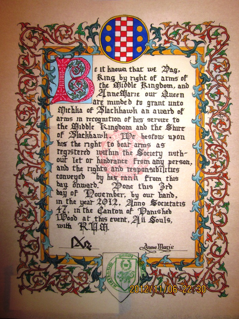
Proclaim unto all that we Lucien, King by right of arms of the Middle Kingdom, and Catarina our Queen, do recognize Sebastian Elgar for his unceasing efforts to bring archery to the Shire of Blackhawk and for his steadfast maintenance of the equipment used by the shire members.  We are therefore minded to create him a Companion of the Order of the Dragon’s Barb.  We bestow upon him all rights and responsibilities attendant upon this rank, and the right to bear the badge of the order without let or hindrance from any person. Done by our hands this eighth day of June, Anno Societatis Forty Eight, at this Border Skirmish in the Shire of Ravenslake.

I still don't much care for my calligraphy, but I suppose the only way to get better is to continue trying.  At this point I am only able to write about 2 or three lines at a time and then I need to take about a 5 minute break.  I know I should relax my hand more, but I concentrate so hard that my hand starts cramping up very quickly.  The following scroll text took a few hours to complete.  Way longer than it should...


The overall design of the scroll was sort of off the cuff.  I sketched out the border after I had completed the calligraphy.  I had a general idea what I wanted to do but simply made it up as I went along.


After the image for the border was completed using pencil I inked it in  using a metal tipped quill pen.  I then painted a base coat of gouache colors.


The overall procedure was basically lay a base coat of red and grey down on the border.  I then came back with a slightly darker color to add shading to the border.  I then added some highlights to the border using a lighter tint of the same colors.  Lastly I added the white work on the top using a fine tipped brush and in some areas a quill pen.


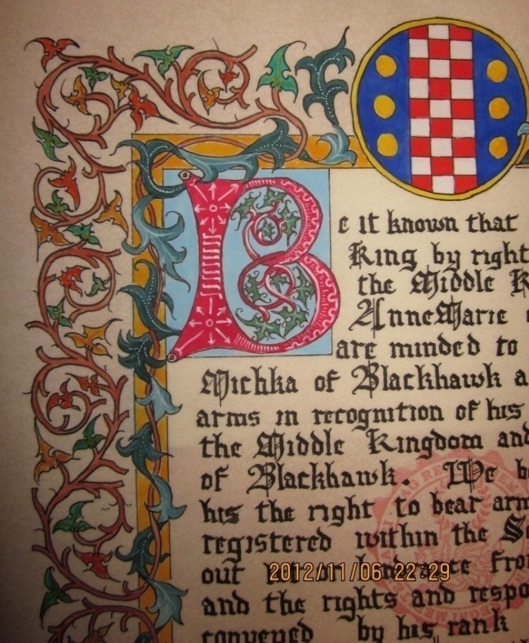
The illuminated letter P was the last touch needed.  I took the design straight out of a calligraphy book I have.  The overall look was intended to stand out as red and dark grey as that appeared to be the colors which the recipient wore most often in the images I found.


Thursday, April 18, 2013

Award of Arms scroll for Janet of Ravenslake

Not a whole lot to post these days as I've been pressing hard to complete all my entries for the Pentathlon this weekend.  I have all 6 entries in a state that I'm OK with entering.  I'd like to do some clean up work and finishing on some of the garments, but I'm flat out of time.

Here is a quick AoA scroll I did recently for "Janet of Ravenslake".  Simple vine work which has no period basis.  I simply made it up.  I knew little about the recipient and was simply asked to make it pretty.  No distinct persona, colors or time period so I chose to do the following:
  

Wednesday, April 3, 2013

Archery Champions Scroll Illumination Completed

Well the scroll was completed and handed off to the calligrapher to complete.  I've described the process in my previous posts so Here I will simply dump some of the pictures of the finishing process.

These are some pics of the illumination still in progress, but getting closer and closer to finishing.  Many details still needed to be added at this point.


This is the finished illuminated blank.  My camera stinks so I provided a couple close ups as well


Tuesday, March 19, 2013

Archery Champions Scroll Illumination

I have been tasked with doing the illumination for this year's Archery Champions Scroll.  I don't much care for nor like the quality of my Calligraphy so when the illumination is completed I will hand off the scroll to another friend who will finish it up.  I searched a long time across many time periods for illuminated manuscripts which depicted archers in action.  I debated long with myself as to the image I should select.  Ultimately I went with the following page as my inspiration:

Illuminated Manuscript, Book of Hours, St. Sebastian, Walters Manuscript W.168, fol. 215v

This fine illuminated Book of Hours was produced in two stages in the second and third quarters of the fifteenth century. The manuscript contains eleven full-page miniatures and twenty historiated initials. The first stage of production includes a section attributed to the Masters of Zweder van Culemborg and the calendar (fols. 3r-14v, 52v-211v), while additional prayers illustrated in the style of the workshop of Willem Vrelant were added later in the fifteenth century (fols. 16r-50v, 213r-223r), presumably when the book was bound in its present binding. The Hours of the Virgin is for the Use of Rome. The Use of the Office of the Dead is unidentified, but the calendar is for the Use of Utrecht. The two separate parts of the manuscript were bound together in Flanders. The sections of W.168 attributed to the Masters of Zweder van Culemborg have been compared to Utrecht, Utrecht University Ms. 1037; Cambridge, Fitzwilliam Museum James Ms. 141; the second hand in New York, Pierpont Morgan Library Ms. M.87; Stockholm, Royal Library A 226, and Philadelphia, Free Library Lewis Ms. 88.

At first I thought about replacing the image of the martyred Saint Sebastian with a target, but I thought on it and decided to simply make the image appear as close to the original as possible.  While we in the SCA reenact and pretend to play warrior I rather think it important to know that the skill we practice was once actually used to commit killings like those depicted.  I hope that the archer who receives the scroll is not only happy with the quality of the workmanship and but can appreciate the historical image and understand the that the skill they now practice was once used for horrendous tasks.

To get things started I sketched out the image on 11x14 Pergamenata. The image was sketched with a mechanical pencil.


Normally I would use a metal tipped dip pen do do all the ink-work  but this time I tried out a new fountain pend that I purchased.  The resulting quality looks much like the original depicted and saved some time since I didn't have to dip the pen 200 times while inking in the outlines.


Here are some progress photos.  I printed out a copy of the original on my color printer and used that as a side by side reference.  The gold work is Holbein Gold Gouache. The rest of the color applied is Reeve's Gouache paint purchased from Michaels.


Close up of the detail work.  I've never done this sort of imagery on a scroll.  The closest thing like this that I have done before was a "period" inspired painting for my game board based on the period painting of the seven deadly sins.  That painting (still not completed) was done in acrylics though.  This is the first time I tried painting an image like this with gouache.  Sort of a trial by fire.  I started by laying down layers of paint which would serve as the background color.  This also helped me space out the image.  I wanted to cover my light pencil sketch lines as well.


As the detail work gets added I imagine that the image in the middle of the illuminated letter will take about 75~80% of the total time spent creating the scroll.  I plan on doing the white work at the very end.  That sort of work I've done a little of before and I have less concern about that.  I want to finish the image in the middle as I have only 5 more days before I have to hand this off to the calligrapher.


 Decided to take a break from the Saint Sebastian painting and finish up some of the detail work around the border.  Added some highlights on the flowers.  I really like this style border and may use it again, without the Saint Sebastian in the middle.


Friday, November 9, 2012

Purple Fret scroll for Heather Marie Hall

Another scroll assignment and another first for me.  I was given a scroll assignment to create an award scroll for a person with Japanese persona.

Name;  Heather Marie Hall  (Heather Rocchi) Midlands/Foxvale
Award:  Award of the Purple Fret
Reason:  for her prolific and steadfast service to Our Kingdom

I was sure I wanted to make a Japanese scroll, but not sure how exactly to go about it.  As it turns out my children are enrolled in a dual language Japanese elementary school.  One of the other parents that has become a friend to the family is a professional writer and Japanese translator.  I provided her with some text which I wanted on a scroll and she reworked it and translated it for me.

Here is the information I provided her with along with a quick translation from Google Translator (which as it turns out kind of sucks).

Let it be known by all that we Dag, King by right of arms of the Middle Kingdom, and AnneMarie our Queen, do recognize the dedicated service that Lady Heather Marie Hall hath freely given unto the Middle Kingdom, specifically as an exceptional scribe.
この日、中世国王のダーグと我々の女王のアンマリーが中世国の優秀な書記官として、レディー・ヘザー・マリー・ホールの立派な役務提供いただいたことを証明する。
We do here publicly praise her and are pleased to bestow upon her the Award of the Purple Fret.
この場、可能な限りの最高の称賛を与えの上で、パープル・フレット賞を授与します。
We grant unto her all rights and responsibilities of this rank and the right to bear the badge without hindrance from any person.
そして、このランクの権利と責任とも、支障なくバッジを身に付ける権利を与します。
Given by our hands this 10th day of November, A.S. 47, at this, our Known World Academy of Rapier and Costume Symposium.
本シンポジウムで、既知世界レイピアとコスチュームアカデミシンポジウム、本日、A.S. 471110日これを成立します。
She wrote the text out in a format more consistent with an actual period notification of this sort.  Without her help I would not have been able to put this together.  This is the text she provided me with which in in Japanese.  The following text includes the Furigana in parenthesis  which is the Hiragana characters included to aid in the pronunciation of the Kanji for those that may not be able to read all of the Japanese characters.  Those are not included in the scroll as they are simply an aid to the reader.  I can actually read a bit of Japanese and this, for me, was very useful.  I now had a scroll which I could actually read and properly pronounce.  I added the Romaji which is the pronunciation written out in English letters.


表彰状(ひょうしょうじょう)
hiyoushyoujyoo

パープル・フレット賞(しょう)
PAAPURU FUREETO shoo

レディー・ヘザー・マリー・ホール様(さま)
REDEII . HEZAA. MARII. HOORU-sama

あなたは優秀(ゆうしゅう)な書記官(しょきかん)として、
anata wa yuushuu na shokikan toshite, 

既知世界(きちせかい)レイピアとコスチューム アカデミ
kisasekai REIPIA to KOSUTUUMU AKADEMI

に立派(りっぱ)な役務提供(えきむていきょう)し、
ni rippo na ekimuteikyoushi,

パープル・フレット賞(しょう)において高(たか)く評価(ひょうか)されました。
PAAPURU FUREETO shou ni oite takaku hyouka saremashita.

そして、このランクの権利(けんり)と責任(せきにん)とも、
soshite, kono RANKU no kenri to sekinin tomo,

支障(ししょう)なくバッジ

を身(み)に付(つ)ける権利(けんり)を与(あた)えます。
shishyou naku BAAJI o mini tsukeru kenri o ataemasu.

よってここに表彰(ひょうしょう)します。
yotte koko ni hyoushyoushimasu.

A.S. 四十七年(ねん)十一月(がつ)十日(にち)
gojunana nen juichi gatsu junichi

既知世界(きちせかい)レイピアとコスチュームアカデミシンポジウム
kichisekai REPIA to KOSUTUUMU AKADEMI SHINPOJIUMU

対決(たいけつ)で勝(か)った中世国王(ちゅうせいこくおう)と
taiketsu de katta chuuseikokuoo to

我々(われわれ)の女王(じょおう) ダーグとアーン・マリー
warewareno shyoo DAGU to AAN MARI.

Now that I had the text I could begin the layout and design.  I knew that I wanted a Japanese image, hopefully of somebody doing artwork.  I found a Japanese woodblock print from the 17th century (I believe) which had a woman painting.  I chose to add that image in the middle of the scroll with a minimal border at the top where the royal seal would be added along with the Purple Fret badge.

The scroll will read from right to left, from top to bottom.

Here is a picture of the image I drew and the printout from the image I found.


I purchased some bamboo pens and brushes, but as it turns out my skill in the use of these new tools was very limited.  I could not write in Japanese well enough to be satisfied.  I could use the brush to write, but the smallest I could manage and still be legible was about three times larger than I wanted for the scroll.  I backed off the authenticity and simply used a quill pen to do all the drawing and writing.

All of the text and drawing in the following photo was done with a crow quill dip pen with India ink.


Here is the layout with the signature boxes and the Purple Fret badge layout.  Yup, I messed up the fret but I think I can fix that later.... I hope.


I'm really VERY happy with the look of the scroll at this point.  Here are some close ups of the the writing.  My wife is Japanese and read this for me.  She can read limited Kanji, but not write it well enough, which is why I didn't ask her to translate it.  She reviewed the text at this point and I got the green light to proceed.


I purchased some Chinese water color paints to use for the color.  I know that the image was based on a wood block print and therefore wanted the overall look and feel to have that same tone and brightness.  I like the look of the water colors as they have a vibrant look but at the same time slightly more muted than the gauche that I've been using.


All in all I couldn't be happier with this scroll.  The image of the woman painting is some of my favorite artwork I've ever done.  I really hope I get to do more Japanese scrolls in the future.


Award of Arms scroll for Michka of Blackhawk

Recent scribble assignment.  I was given an AoA to create and here is a very limited documentation of what and how I did it.

As with all my scrolls, the design in a free hand sketch using a mechanical pencil.  I chose Pergamenata as the material to make the scroll from.  I had little information about the recipient other than the fact that the person was currently the exchequer for the shire of Blackhawk and so I chose to add the badge to the top of the scroll.  Little else was known about persona or interests so I chose to make a "generic" middle period style scroll.

Calligraphy first... I used a metal tipped dip quill pen to do all the work on this scroll.  I used a crow quill tip to clean up some of the lines and improve the sharpness of some of the letters.  Still don't care much for my calligraphy but I guess that's part of the game.  Illumination is by far my favorite aspect.


After calligraphy is completed and cleaned up I started inking in the trim.


I was thinking of using green ink for the vine-work as I have on other scrolls, but opted to keep it more like the illuminated manuscript that inspired this design.


All the inking done.  I actually sketched the illuminated letter on a separate piece of paper and then traced it onto this page.  Tried a few designs so rather than sketching over and over on this page I wanted to finalize the design before transferring it.


I used all gauche paint for this scroll.  Base coat of two distinct shades of green for the trim was applied first.


More details and colors added...


Illuminated letter completed and white work just about done...


Completed scroll.  Well, almost.  Turns out that the scroll assignment was given to me for a woman.  The text I used included three references to "her".  When I witnessed the award in court I then found out that the recipient was a man.  Oops.  Felt like a fool and offered to try and fix the problem.


Here is the stamped and signed scroll after the fixes were applied.  My calligraphy isn't as good as I would like, but it turns out my talents at fixing calligraphy sucks more.  Oops.  The "her" references were updated to "his" but are clearly visible.  Pergamenata is more forgiving that Bristol board, but still doesn't take a second coat of ink all that well.  When I tried to write the fixed letter the ink bled very quickly and looked smudgey. I guess I shouldn't make mistakes in the future.  Ick!