
I originally started this post in May of 2011. I never completed the post as I wasn't ready to go on record with my latest project. I subsequently lost my hard drive which had a lot of my research on it. I have now decided to breathe new life into this idea again. And so it begins again...
________________________________________________________________________
I have wanted to take up period calligraphy for some time now. Well, I have done some calligraphy for some scrolls but I would by no means consider myself a calligrapher yet. I have tried cutting some of my own quills. I collected some goose feathers from a local pond and practicing cutting them. I made my own black walnut ink to use with the quills. I've had some recent experiments with pounce. And all for what you might ask. Well I've been thinking how wonderful it would be if I went to events with some sort of reading material which was period. Rather than simply copy some period work of fiction, I decided to attempt to begin creating a period looking Bible. Now I don't have any grand plans to copy the entire Bible. That would be silly, even for me. I would, however, like to transcribe one book of the Bible. I have narrowed down the translation I plan on using for the work and I have decided on the Gospel according to Matthew.
There are a variety of period Bibles which I had to choose from:
Originally I started looking at using the Bishop's Bible, but have since decided against it. I found a couple places online where you can find the period text, in its original form. It is very difficult to read in this period form due to the spelling "issues" they had.
Using StudyLight.org you can search various versions of the Bible text. http://www.studylight.org/
You'll note in the following examples that the notion of spelling was quite different back in the 1500s.
Here are the first two verses from the Gospel according to John from three sources:
NIV:
In the beginning was the Word, and the Word was with God, and the Word was God. He was with God in the beginning.
King James:
In the beginning was the Word, and the Word was with God, and the Word was God. The same was in the beginning with God.
The Bishop's Bible:
In the begynnyng was the worde, & the worde was with God: and that worde was God. The same was in the begynnyng with God.
The Tyndale New Testament:
In the beginnynge was the worde and the worde was with God: and the worde was God. The same was in the beginnynge with God.
I've chosen to use The Tyndale New Testament as the basis for my work. "The Tyndale Bible generally refers to the body of biblical translations by William Tyndale." Tyndale was inspired by Martin Luthers work in translating the Bible. His work in translation of the New Testament is the English translation from the original texts. It was also used as one of the sources for the later King James version. When I came across this version of the Bible, it just seemed like the right choice for my efforts. The Tyndale Bible was actually printed, but I plan on transcribing using another church book as a basis for my design: Breviarium Romanum
I found an online source which had an entire book which I was able to collect enough information from to generate style which I liked. The book Breviarium Romanum can be found here: Manuscript Collection
Breviarium Romanum.
OM BX2000.A2 1450 [264] leaves (2 columns, 31 lines) :
vellum ; 16 cm. [2nd half of 15th century].
The volume comprises: a Calendar; a Ferial Psalter followed by a hymnal; and the Temporal with a Litany.
It has no Sanctoral. On vellum; in Latin; Gothic script; rubricated. Main Author: Catholic
Church.
Published: 1450
Subjects: Catholic
Church > Liturgy > Texts.
Breviaries > Texts.
Online Access: Villanova Digital Library
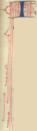
See the following page for a sample from the book:
Although the book was in Latin, I began the process of scanning through the book in search of letters which may serve as an example of the "hand" which I'd like to use. I originally planned on including some illumination, however I have since decided against it. I'll be using the style found in teh Breviarium Romanum and include only rubricated script. A rubricated script is where the initial letters are larger and decorated most often in either red or blue.
It appears that the original manuscript was 4.25 x 6.25 in. with
2 columns, 31 lines of text per page.
The vellum sheets I purchased are 8 x 10 in. I plan on using quarter pages to maximize the
amount of script I can place on a page.
To compensate for the slightly smaller page size I will shorten the
bottom edge of the layout.

As you can see I'll be using quarter sheets of the vellum for each page and the final page is slightly shorter than the period page.

The following charts were used to collect a sample of each letter I would need. I first took all of the text from the book of Matthew and then generated a distinct list of characters. I created these charts so that as I found an example of each one I could copy it here to be used later as my template for creating my "alphabet". I also included a couple other columns which show examples provided by the Middle Kingdom Scribal Handbook.
| Character | MKSH Roman Sq. | B.R. Roman Sq. | MKSH Gothic Versal | B.R. Gothic Versal |
| A |   |
 |
  |
  |
| B |  |
  |
 |
  |
| C |   |
 |
 |
 |
| D |  |
 |
 |
  |
| E |  |
  |
 |
  |
| F |  |
 |
 |
   |
| G |   |
 |
 |
  |
| H |  |
  |
 |
  |
| I |  |
 |
 |
  |
| J |  |
|||
| K |  |
 |
  |
|
| L |  |
 |
 |
  |
| M |  |
  |
  |
  |
| N |  |
 |
 |
  |
| O |  |
 |
 |
  |
| P |  |
  |
 |
  |
| Q |  |
 |
  |
  |
| R |  |
 |
 |
  |
| S |  |
 |
 |
 |
| T |  |
 |
  |
 |
| U |  |
 |
 |
  |
| V |  |
 |
 |
|
| W | ||||
| x |  |
  |
 |
|
| Y |  |
  |
||
| Z |  |


I started with the Tyndale text and then began "converting" it to a more "medieval" type text. As the book would be hand written I adopted some common principals of short hand to reduce the overall count of letters which would need to be written. The following steps were performed to the Tyndale text to create the version of the text I plan to transcribe.
(Note that depending on your browser and font set you may not see some of the special characters used. You will have to wait until I create a hand written version and scan that in.)
Steps to convert text to usable format:
- Remove verse numbers
- Convert chapter numbers to roman numerals.
- Convert 'sk' to 'sc' throughout
- Convert 'ks' to 'x'.
- Convert remaining 'k' to 'c'.
- Replace all 'v' with 'u'
- Replace ' u' with ' v'
- Remove a last letter 'n' or 'm' and replace with a dash over preceeding letter.
- Replace 'an' and 'am' with ā
- Replace 'en' and 'en' with ē
- Replace 'in' and 'im' with ī
- Replace 'on' and 'om' with ō
- Replace 'un' and 'um' with ū
- Replace 'qu' with 'q̄'
- Replace 'g' at the end of a word with 'ȝ'
- Replace 'g ' with 'ȝ '
- Replace 'g,' with 'ȝ,'
- Replace 'g.' with 'ȝ.'
- Replace 'g;' with 'ȝ;'
- Replace 'g:' with 'ȝ:'
- Replace 'w' with 'Ƿ'
- Replace any r following a round letter with a 1/2 r
- Replace 'br' with a 1/2 r 'bᶉ'
- Replace 'cr' with a 1/2 r 'cᶉ'
- Replace 'er' with a 1/2 r 'eᶉ'
- Replace 'or' with a 1/2 r 'oᶉ'
- Replace 'pr' with a 1/2 r 'pᶉ'
- Convert all 's' to long s 'ᶴ'
- Convert all last s of word to round s
- Replace 'ᶴ.' with 's.'
- Replace 'ᶴ ' with 's '
- Replace 'ᶴ,' with 's,'
- Replace 'ᶴ:' with 's:'
- Replace 'ᶴ;' with 's;'
- Replace 'that' with 'Ђt' (Thorn with stroke). Note that there are many occurrences of 'yt' as the word 'that' which were not modified from Tyndale.
- Replace 'they' with 'Ђy' (Thorn with stroke)
- Replace 'this' with 'Ђs' (Thorn with stroke)
- Replace 'thou' with 'Ђu' (Thorn with stroke)
- Replace 'not' with 'ňt'
- Looked through entire document to determine count of each unique word to determine best use of abbreviations. There were 87 words which occurred over 80 times in the document so I decided to come up with an abbreviation algorithm similar to what might have been used by a period scribe. Created following abbreviations:
- Replace 'the' with 'ť' Note: this is the single most prevalent word. Reducing to a single letter would save over 2400 characters of calligraphy.
- Replace 'ᶴhall' with 'śl'
- Replace 'to' with 'ť'
- Replace 'of' with 'ǒ'
- Replace 'vnto' with 'ṽo'
Note: During the "abbreviation" process I was able
to reduce the number of letters required by over 12,000 letters That is a saving of approximately 12% of the total
calligraphy required.
Here is a sample of the "converted" text:
Here is a sample of the "converted" text:
Chapteᶉ
III
In thoᶴe dayes Ihō ť Baptyᶴt cāe ād pᶉeached ī ť Ƿildeᶉnes ǒ Iury ᶴaynge;
Repet ť cyngdōe ǒ heue is at hōde. This is he ǒ Ƿhō it is ᶴpocē by ť Prophet Eᶴay
Ƿhich ᶴayeth: The voyce ǒ a cᶉyeᶉ ī Ƿyldeᶉnes pᶉepare ť Loᶉdes Ƿaye ād mace hys
pathes ᶴtrayght. This Iho had hys garmet ǒ cāels heeᶉ ād a geᶉdell ǒ a ᶴcynne
aboute his loynes. Hys meate Ƿas locuᶴtes ād Ƿylde hōy. The Ƿēt oute ť hym Ieᶉuᶴalē
ād all Iury ād all ye regio roude aboute Ioᶉda ād Ƿeᶉe baptiᶴed ǒ hī ī Ioᶉda
cofeᶴᶴynge their ᶴynnes. Other Notes:
- First letter of each verse
will be illustrated using the decorated Gothic Versals.
- All capitals other than
beginning of verse will be colored and Roman Square.
- Even capitals will be red.
- Odd capitals will be blue.
- I may replace 'a' with æ for
certain letters as I read through the text.
- When lowercase 't' is last
letter use the version with the tail hanging off the cross section.
- This is a rubricated
manuscript. That means "add
elaborate, typically red, capital letters or other decorations to (a
manuscript)." Very small letters written by the calligrapher can be
seen indicating what capital letter needed to be added later. I intend to go through and do the
calligraphy with the same approach and then add the red and blue capital
letters later.
I anticipate that this project will take a number of years. Progress will be slow. I may not post often on this project as every page will be much like the previous ones. The process will likely take a couple hundred pages.

I initially created a mock-up of the book to determine how many sheets of parchment I would need to purchase. I had purchased 9 pages of goatskin and 9 sheets of calf skin vellum. After examining the calf skin I decided that although slightly more expensive that would be the surface I would use for my book. The thickness and surface appearance was much like that of index card stock. I took about a dozen manilla folders and cut them into shees of 8X10 inches. That would replicate the approximate size of the parchment I could use. I stacked 9 sheets of manila folders together and it turned out that it was almost exactly the same thickness as the vellum. I would be a perfect surrogate for my mock-up. I cut a few different size of folders to determine the best way to get the most out of the high cost vellum. I decided that anything smaller than sheets of 4X5 inches would not be practical. I cannot write small enough to make a "miniature" book so the quarter sheet would be about right for my skill set. I bound a dozen folios to determine how thick the finished book would be. I also made a large variety of mock-ups in Word to see if I could some how estimate the number of pages accurately. I could not find a good computer font to use that would give me the look and feel I wanted and best predict the size of the writing I would need. Ultimately I decided that the only way to get a good predictor was to create my own computer font using my own hand as the template. I plan on attempting to design my own computer font. I will do this to scale to get a better representation of the script that needs to be written. I can then print out the manuscript and use that as a basis for my copying.

Next Steps
I initially created a mock-up of the book to determine how many sheets of parchment I would need to purchase. I had purchased 9 pages of goatskin and 9 sheets of calf skin vellum. After examining the calf skin I decided that although slightly more expensive that would be the surface I would use for my book. The thickness and surface appearance was much like that of index card stock. I took about a dozen manilla folders and cut them into shees of 8X10 inches. That would replicate the approximate size of the parchment I could use. I stacked 9 sheets of manila folders together and it turned out that it was almost exactly the same thickness as the vellum. I would be a perfect surrogate for my mock-up. I cut a few different size of folders to determine the best way to get the most out of the high cost vellum. I decided that anything smaller than sheets of 4X5 inches would not be practical. I cannot write small enough to make a "miniature" book so the quarter sheet would be about right for my skill set. I bound a dozen folios to determine how thick the finished book would be. I also made a large variety of mock-ups in Word to see if I could some how estimate the number of pages accurately. I could not find a good computer font to use that would give me the look and feel I wanted and best predict the size of the writing I would need. Ultimately I decided that the only way to get a good predictor was to create my own computer font using my own hand as the template. I plan on attempting to design my own computer font. I will do this to scale to get a better representation of the script that needs to be written. I can then print out the manuscript and use that as a basis for my copying.